
The making of Stopping to Smell The Roses- sample web and print graphic design layouts
Assignment overview
Made for IAT 102 (Graphic Design) Project 2, taken at SFU in Summer 2020. All photos were composed and shot by myself in addition to the graphic design (the main focus of the project) of the layouts, which was a collaborative effort with my classmate, Cara Cheng, created primarily in InDesign.


Process


Ideation and sketching
Shown here are all of the concept rough sketches I came up with for both the web and print layouts. Though my partner contributed some as well, when we met and discussed peer and TA feedback, we ended up settling on my theme and concept (focusing on fashion) and thus, my sketches and designs were the ones incorporated into the final product.
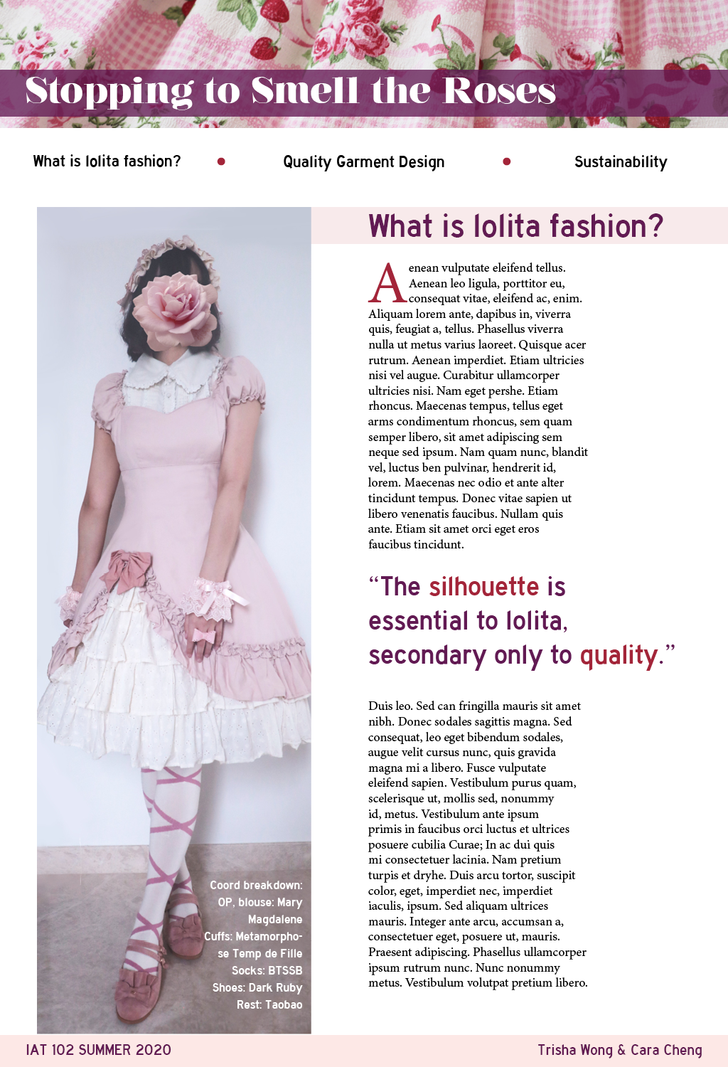
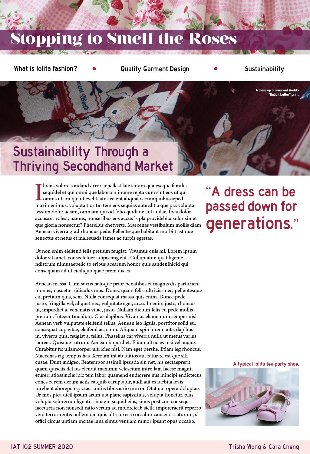
I wanted to do a trendy and stylish fashion article, and one of my interests happens to be a Japanese street fashion that is all about elegance and femininity. The photos I took ended up forming the basis of the loosely analogous color palette used using shades of pinks, reds, and purples so that visually everything felt cohesive and had a sense of unity.
Typefaces and color scheme
The Nouvelle Vague typeface was chosen due to its stylish vertical stress- the extreme thinness of certain stems and serifs form a high contrast to the thickness of the other parts of lettering. It is a common aesthetic for vogue-type fashion magazines, making it a perfect fit for this sample set of layouts. Because of the thinness, it only works at large heading sizes. Highway Gothic was chosen for its sleek sharp edges and was a good sans serif to contrast the extreme serif heading type. The color scheme, as mentioned, was pulled from the photos, but the photos were also in turn staged around the concept. It was always going to have dusty pinks as the base color with rich, sharp accent colors, and this was what formed the basis of the analogous tri-color palette.


Print grid design

I went with a 3 column grid for the print layout because the dimensions of the main focal picture, the very tall outfit photo, could only fit naturally into a column of that size. As a side effect, the wider columns made the large amount of body text easier to read. It also ended up being the most aesthetically space efficient for including smaller photos and quotations.
Web grid design

For the web layouts, I went with a 12-column layout. Since we ended up with more space than expected for the web layouts, we added one extra creative-commons photo retrieved online on the introductory home page (though it should be made clear that all other assets besides the photo of the mannequin were taken by me). We chose my close-up photo of one of my floral print dresses as the banner image to emphasize the theme, and because, as with the print layout, it represents the article title of “smelling the roses”.
Closing thoughts and reflection
Legibility was definitely less of a problem in the medium of print, as the simplistic three columns made it fairly easy for the eye to follow across the page when reading the body text. On the other hand, the way that we arranged information in the web layout, overall using much wider and unbroken up text boxes, meant that the reader’s eye would constantly be tracking across much longer distances while reading the body text, making it more difficult to establish a clear visual hierarchy at a glance. We tried to resolve this by giving generous margin padding populated with extra photos or quotations, and breaking the body text into more narrow columns where the layout allowed.
The spaciousness of a scrolling web layout also allowed for much bigger spreads of images to use as a casual backdrop rather than as a focal point, without getting too visually busy. Using predetermined text and images was most difficult in the print layout, as the column-based text meant constantly checking everything was flush without orphans or widows, and the sentences were so long it was very difficult to choose where to end paragraphs without ruining everything.
Lastly, as mentioned earlier, the color scheme was derived from the photos taken. The main consideration while using it was how we would use it to emphasize the visual hierarchy. This was fairly easy to do in the print layout where it can be seen at a glance, but for web, it’s more difficult to establish that across the multiple different webpage layouts, so in addition to utilizing the color palette where we could in the content of the pages, we used it in the Master layout of the banner and footer. The saturated bright red was used only as a highlighting accent color like the roses in the title heading photo, while the purple signified an understated importance, as part of establishing the visual hierarchy.