
The making of Late Nights - a graphic novel


Assignment overview
Late Nights was created for Project 2 in the class IAT 100 (Digital Image Design) which I took at SFU in Summer 2020. The focus of the project was on conveying an original narrative through sequential design in a graphic novel format. Particularly, the emphasis was on coming up with original shot compositions and utilizing a spread of panel transitions. I ended up receiving an A+ on this project and in the class as a whole.
Process


Adaptation, or writing an original story?
Given the limited scope of the assignment, particularly the production timeline being less than a month from start to finish, I struggled to think of a story short enough to feasibly adapt for this project that I also liked enough to do that wasn’t already in graphic novel format. Ultimately, I ended up writing my own short story based on the characters and setting of an existing anime and manga series, BEASTARS, which I was a big fan of at this time.
Though I wrote it with adapting it to a graphic form in mind, articulating the actions and expressions clearly in each scene, part of the assignment required the story to be marked up by hand to differentiate what described faces, actions, settings, and text such as dialogue.
Draft sketches
Having been a fan of Beastars for quite some time, I’m fairly familiar with how the characters are drawn and have drawn them frequently myself. However, before I started the actual drawing process, I ended up skimming through the original manga to get a better grasp of how the author actually worked with comics as a medium to get some inspiration for myself, particularly for paneling and framing. This was particularly useful in the early, most important stages, when I was drafting and doing the rough sketches. For example, the frequent use of open, borderless panels/spreads for dramatic moments that take up a lot of the page was something I liked a lot and decided to incorporate myself. Doing these rough sketches served to plan out general paneling/page layouts and framing, rough poses and expressions, positioning of dialogue balloons and text, and angles. Peer feedback review sessions showing these sketches were useful in gauging how varying audience types- people who are either familiar or unfamiliar with manga- would engage the material.


Composition
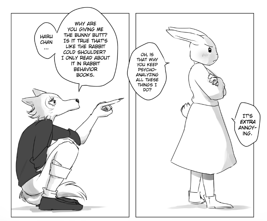
My choice of panel transitions varied depending on what the story called for and the actions taking place, and I ended up using all panel transition types except non-sequiturs. Aspect-to-aspect transitions in Japanese manga is undoubtedly one of my favorite things about it as a medium, and one I tried to emulate in order to set not just the setting but the tone/mood of the whole story. I wanted the reader to piece things together like the panels are shots from a movie with the dialogue or monologue running alongside it.
Loosely related to this is my deliberate use of negative space and intervals, common in Eastern style storytelling. Besides the negative space silhouettes used in the 10th page and the climax of the story (also used for the title page) to create a jarring clashing feeling for the reader, there are a couple of instances where the background fades in and out of black for a short while. These serve to take the reader “out” of the current story and action into a limbo-like void of imagination just as mangaka do with intervals in making the elements omitted from the work still part of the work.


Paneling and ballooning
Clip Studio Paint (CSP) became my main program of choice for the vast majority of this project, as it was designed to be used by manga artists. I used CSP’s comic paneling tool to draw up the panels with the sketches on top on a lower opacity. Then I worked each page one at a time with roughly the same approach.
I used CSP’s speech ballooning tool to hand draw most of the bubbles (including jagged exclamation boxes) and the rectangle shape tool for the monologue boxes. Then I add the text on top as a new layer, using the font CC Wild Words for most of the body text, BD Cartoon Shout for shouting dialogue, and hand drawing sound effects or other text with various brushes.
Inking and shading
I started with drawing cleaner lines for the character art, as the characters are the main focus of this work rather than background illustration. I then added basic shading, particularly in the bigger panels with bigger scenes that feature both the characters.

For example, despite the plain background I added light shading to indicate the light source is shining down the middle between them, calling back to how this is all taking place in the street under one streetlamp (even if it isn’t shown).
I also used gradients and fills for backgrounds both behind the panels and within the panels to help set the mood. Below, the shadow that suddenly appears on his face and the gradient behind match his realization and consequent sudden drop in mood, like a literal dark cloud.

The dark gradients behind the panels usually serve to gradually introduce a tonal shift for whatever happens in that darkness. For example, here I attempted to completely invert colors to silhouette a particularly dramatic moment that I consider the climax of this short little story. More generally though, it takes the reader kind of “out” of what’s going on in the actual panels.
